
Urban Alert
Urban Alert
Role
Role
UX/UI Designer
UX/UI Designer
Timeline
Timeline
Aug 2023 - Nov 2023
Aug 2023 - Nov 2023
Project Type
Project Type
Team Project (3)
Team Project (3)
Tools/Skills
Tools/Skills
UX/UI Design, User Research, Prototyping, Usability Testing, Figma
UX/UI Design, User Research, Prototyping, Usability Testing, Figma
Project Overview
Project Overview
Urban Alert is a community reporting app that helps Sydney residents easily flag local issues such as potholes, vandalism, and public maintenance problems. By making reports visible to everyone, the app promotes transparency, shared awareness, and collective input on which issues should be prioritised.
Urban Alert is a community reporting app that helps Sydney residents easily flag local issues such as potholes, vandalism, and public maintenance problems. By making reports visible to everyone, the app promotes transparency, shared awareness, and collective input on which issues should be prioritised.
At its core, Urban Alert lowers the barrier to civic participation, helping people feel that raising everyday concerns can lead to meaningful, visible change in their neighbourhoods.
At its core, Urban Alert lowers the barrier to civic participation, helping people feel that raising everyday concerns can lead to meaningful, visible change in their neighbourhoods.
The Problem
The Problem
I worked on this project after noticing how often small but recurring infrastructure issues are ignored or poorly communicated. While residents are encouraged to report problems, there is little visibility into what happens after a report is submitted, which weakens trust and discourages ongoing participation.
This raised the question of how digital tools could better support communication between residents and local councils, and how reporting systems could feel more transparent, accountable, and worth engaging with.
This raised the question of how digital tools could better support communication between residents and local councils, and how reporting systems could feel more transparent, accountable, and worth engaging with.
Key Takeaways
Key Takeaways
Transparency builds trust when people can see issue status, progress, and outcomes over time.
Shared decision-making gives communities agency, allowing residents to influence what gets prioritised and addressed.
Early user testing reveals critical usability gaps, especially around navigation and visual clarity, guiding more effective refinements.
Lowering effort increases participation, particularly for everyday civic actions that need to happen quickly and in real-world contexts.
Context & Evidence
Context & Evidence
Cities depend on shared public infrastructure to support everyday life, yet many local issues such as potholes, broken lighting, and damaged amenities remain unresolved or lack clear communication. While residents are encouraged to report these problems, many feel disconnected from local councils and unsure whether their input leads to real action. Over time, this uncertainty contributes to frustration and weakens trust in public services.
Cities depend on shared public infrastructure to support everyday life, yet many local issues such as potholes, broken lighting, and damaged amenities remain unresolved or lack clear communication. While residents are encouraged to report these problems, many feel disconnected from local councils and unsure whether their input leads to real action. Over time, this uncertainty contributes to frustration and weakens trust in public services.
Government research identifies social infrastructure as essential to quality of life and economic growth, highlighting the importance of maintaining public spaces that people rely on daily (Infrastructure Australia, 2019).
Studies also show that many Sydney residents feel disconnected from local authorities, with low satisfaction and limited engagement around infrastructure decisions and maintenance (AECOM, n.d.).
User Research
User Research
To understand why Sydney residents feel disconnected from local infrastructure maintenance, we combined focus groups, surveys, and online observations. Across all methods, people shared similar frustrations around broken facilities, unclear repair progress, and a lack of visible communication from local councils.
To understand why Sydney residents feel disconnected from local infrastructure maintenance, we combined focus groups, surveys, and online observations. Across all methods, people shared similar frustrations around broken facilities, unclear repair progress, and a lack of visible communication from local councils.
Conversations with Residents
(Focus Groups — led by me)
(Focus Groups — led by me)
12 Participants
12 Participants
4 Focus Groups
4 Focus Groups
I facilitated four focus groups with 12 participants to explore everyday experiences with public infrastructure. Participants described feeling uncertain after reporting issues, often receiving little to no feedback on whether problems would be addressed. This lack of visibility and system feedback reduced trust and discouraged continued participation, highlighting the need for clearer updates and user involvement in prioritisation.
Patterns at a Broader Scale
(Surveys & Online Analysis — team-led)
(Surveys & Online Analysis — team-led)
Alongside the focus groups, our team collected 48 survey responses and reviewed 25 public posts from Reddit and Xto understand broader public sentiment around infrastructure reporting.
48%
48%
experienced infrastructure issues that disrupted daily activities
experienced infrastructure issues that disrupted daily activities
70%
70%
were unaware of any council initiatives addressing these problems
were unaware of any council initiatives addressing these problems
Online discussions reinforced these findings, highlighting slow responses, unclear progress, and frustration with accountability. This directly informed the decision to prioritise visible issue status, progress tracking, and transparent feedback in the app.
Key Insights
Infrastructure Neglect
Infrastructure Neglect
Residents perceive public infrastructure as long-neglected, leaving everyday spaces unsafe and poorly maintained.
Residents perceive public infrastructure as long-neglected, leaving everyday spaces unsafe and poorly maintained.
Community Frustration
Community Frustration
Ongoing poor upkeep disrupts daily routines and weakens people’s sense of trust and connection to public services.
Ongoing poor upkeep disrupts daily routines and weakens people’s sense of trust and connection to public services.
Demand for Accountability
Demand for Accountability
Residents want clearer updates, visible progress, and confirmation that their reports lead to action.
Residents want clearer updates, visible progress, and confirmation that their reports lead to action.
Persona
This persona represents Sydney residents observed throughout our research and was used to ground design decisions in real behaviours, motivations, and everyday reporting needs. It helped guide decisions around transparency, trust, and ease of participation.
This persona represents Sydney residents observed throughout our research and was used to ground design decisions in real behaviours, motivations, and everyday reporting needs. It helped guide decisions around transparency, trust, and ease of participation.

Chloe Summers, 20
Chloe Summers, 20
Chloe Summers, 20
2nd Year Commerce student
2nd Year Commerce student
Daily Driver
Daily Driver
Sydney, NSW
Sydney, NSW
Chloe commutes daily to university and depends on local roads and public infrastructure. While she reports issues when they affect her routine, the lack of clear feedback has made her feel disconnected and unheard. Over time, she has become sceptical about whether local councils act on resident concerns.
Chloe commutes daily to university and depends on local roads and public infrastructure. While she reports issues when they affect her routine, the lack of clear feedback has made her feel disconnected and unheard. Over time, she has become sceptical about whether local councils act on resident concerns.
Challenges
Challenges
Unclear feedback after reporting issues
Ongoing encounters with poorly maintained roads and facilities
Low confidence that reporting leads to real action
Feeling disconnected from council decision-making
Unclear feedback after reporting issues
Ongoing encounters with poorly maintained roads and facilities
Low confidence that reporting leads to real action
Feeling disconnected from council decision-making
Motivations
Motivations
See visible action taken on reported issues
Feel trust and accountability from local authorities
Report problems quickly and easily
Travel safely in everyday routines
See visible action taken on reported issues
Feel trust and accountability from local authorities
Report problems quickly and easily
Travel safely in everyday routines
Core Insight
Core Insight
Chloe isn’t unwilling to report issues; she’s discouraged by a lack of visibility and follow-through. Clear updates and transparent progress are key to rebuilding trust and encouraging participation.
Chloe isn’t unwilling to report issues; she’s discouraged by a lack of visibility and follow-through. Clear updates and transparent progress are key to rebuilding trust and encouraging participation.
Design Challenge
Design Challenge
The key challenge was to design a civic reporting experience that builds trust and encourages continued participation. Research showed that unclear feedback, lack of system transparency, and minimal visibility of outcomes discouraged residents from reporting issues and reduced confidence in local councils.
The key challenge was to design a civic reporting experience that builds trust and encourages continued participation. Research showed that unclear feedback, lack of system transparency, and minimal visibility of outcomes discouraged residents from reporting issues and reduced confidence in local councils.
This meant the solution needed to prioritise clear system feedback, visible progress over time, and low-effort interactions that make civic participation feel worthwhile and reliable.
This meant the solution needed to prioritise clear system feedback, visible progress over time, and low-effort interactions that make civic participation feel worthwhile and reliable.
Exploring Solutions
Exploring Solutions
We explored early concepts focused on improving transparency and user confidence in civic reporting. We mapped different ways residents might submit issues, track updates, and understand council responses across devices. Each concept was assessed based on how well it supported visibility, ease of use, and trust, which helped us converge on a direction that emphasised clear feedback loops and collaborative visibility across mobile and smartwatch platforms.
We explored early concepts focused on improving transparency and user confidence in civic reporting. We mapped different ways residents might submit issues, track updates, and understand council responses across devices. Each concept was assessed based on how well it supported visibility, ease of use, and trust, which helped us converge on a direction that emphasised clear feedback loops and collaborative visibility across mobile and smartwatch platforms.
Initial Concepts
Initial Concepts
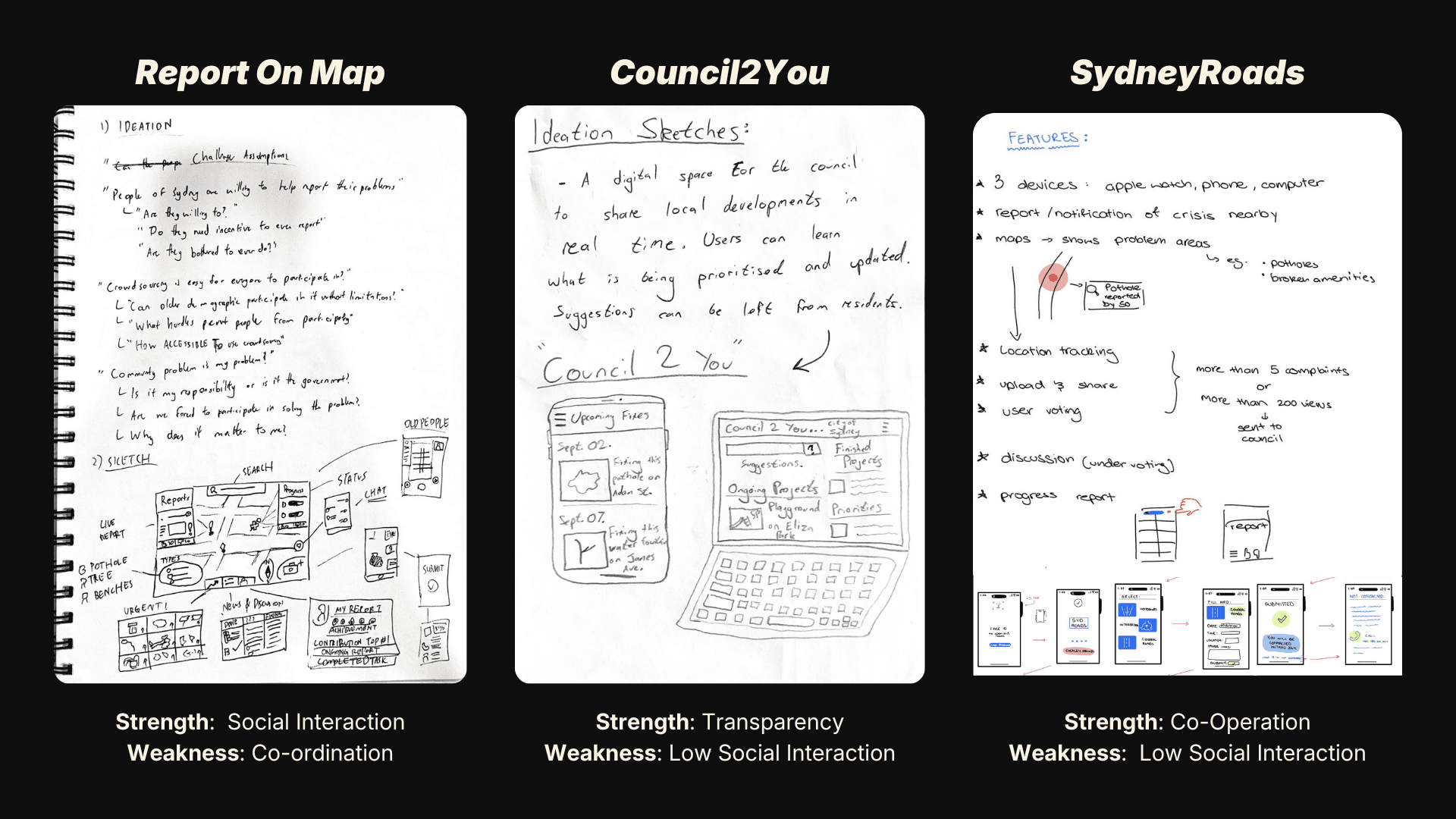
To move forward, we compared our early concepts by mapping key user journeys and identifying where interaction created the most value. We focused on how easily users could report issues, track progress, and feel confident using the system. This helped us converge on a single direction: a multi-device design that prioritises transparency and clear system feedback.
To move forward, we compared our early concepts by mapping key user journeys and identifying where interaction created the most value. We focused on how easily users could report issues, track progress, and feel confident using the system. This helped us converge on a single direction: a multi-device design that prioritises transparency and clear system feedback.
Chosen Concept
Chosen Concept
Prototyping
Prototyping
Wireframe
Wireframe
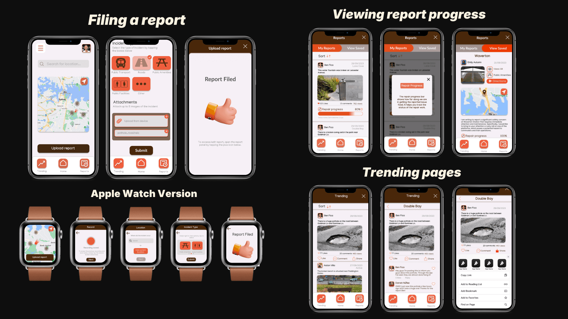
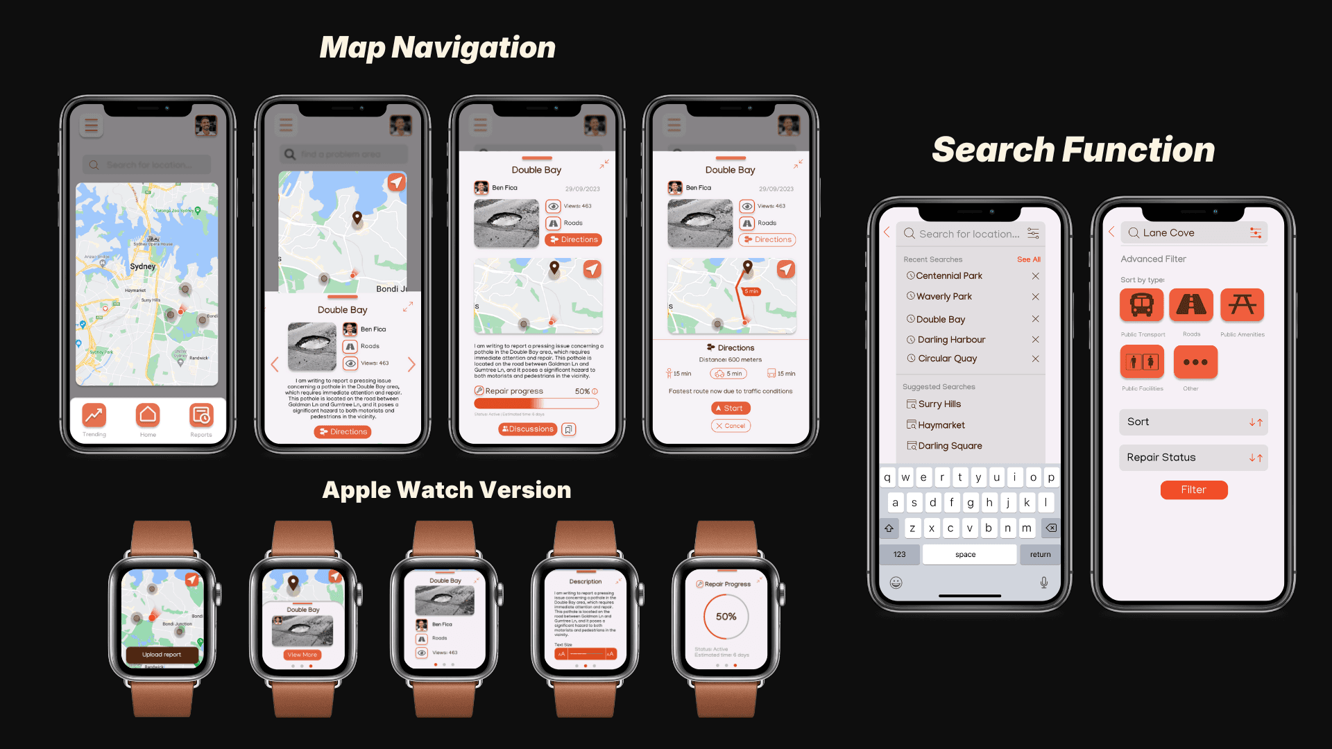
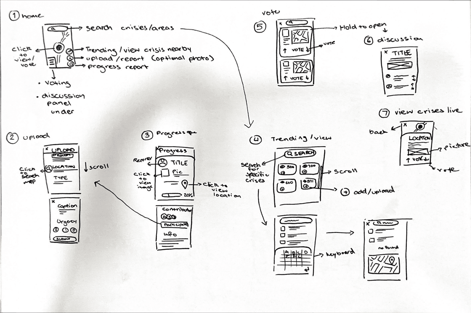
We began by sketching our refined concept and developing wireframes for seven core tasks, five for mobile and two for Apple Watch. I focused on designing the map-based navigation, search, and filtering to make issue discovery and reporting quick and intuitive across both platforms.
We began by sketching our refined concept and developing wireframes for seven core tasks, five for mobile and two for Apple Watch. I focused on designing the map-based navigation, search, and filtering to make issue discovery and reporting quick and intuitive across both platforms.
Usability Testing
Usability Testing
We tested our wireframes with users and experts to identify usability issues early. Twelve participants completed key tasks using a think-aloud method, which revealed points of confusion around navigation, labels, and system feedback. In parallel, experts conducted cognitive walkthroughs to assess clarity, accessibility, and overall flow.
We tested our wireframes with users and experts to identify usability issues early. Twelve participants completed key tasks using a think-aloud method, which revealed points of confusion around navigation, labels, and system feedback. In parallel, experts conducted cognitive walkthroughs to assess clarity, accessibility, and overall flow.
All findings were grouped into a severity chart to prioritise the most critical issues and guide the next round of design decisions.
All findings were grouped into a severity chart to prioritise the most critical issues and guide the next round of design decisions.
What We Found
What We Found
Clearer Navigation
“My Reports” and “View All” were often confused, making it unclear whether users were viewing their own reports or all community issues.
Report Scanability
Users struggled to quickly identify and compare reports without dates or time context.
Consistency & clarity
Inconsistent labels and capitalisation, especially around the “Edit” action, caused uncertainty and reduced confidence.
In-context guidance
Users needed more support during key tasks, as several actions were not immediately self-explanatory.
Clearer Navigation
“My Reports” and “View All” were often confused, making it unclear whether users were viewing their own reports or all community issues.
Consistency & clarity
Inconsistent labels and capitalisation, especially around the “Edit” action, caused uncertainty and reduced confidence.
Report Scanability
Users struggled to quickly identify and compare reports without dates or time context.
In-context guidance
Users needed more support during key tasks, as several actions were not immediately self-explanatory.
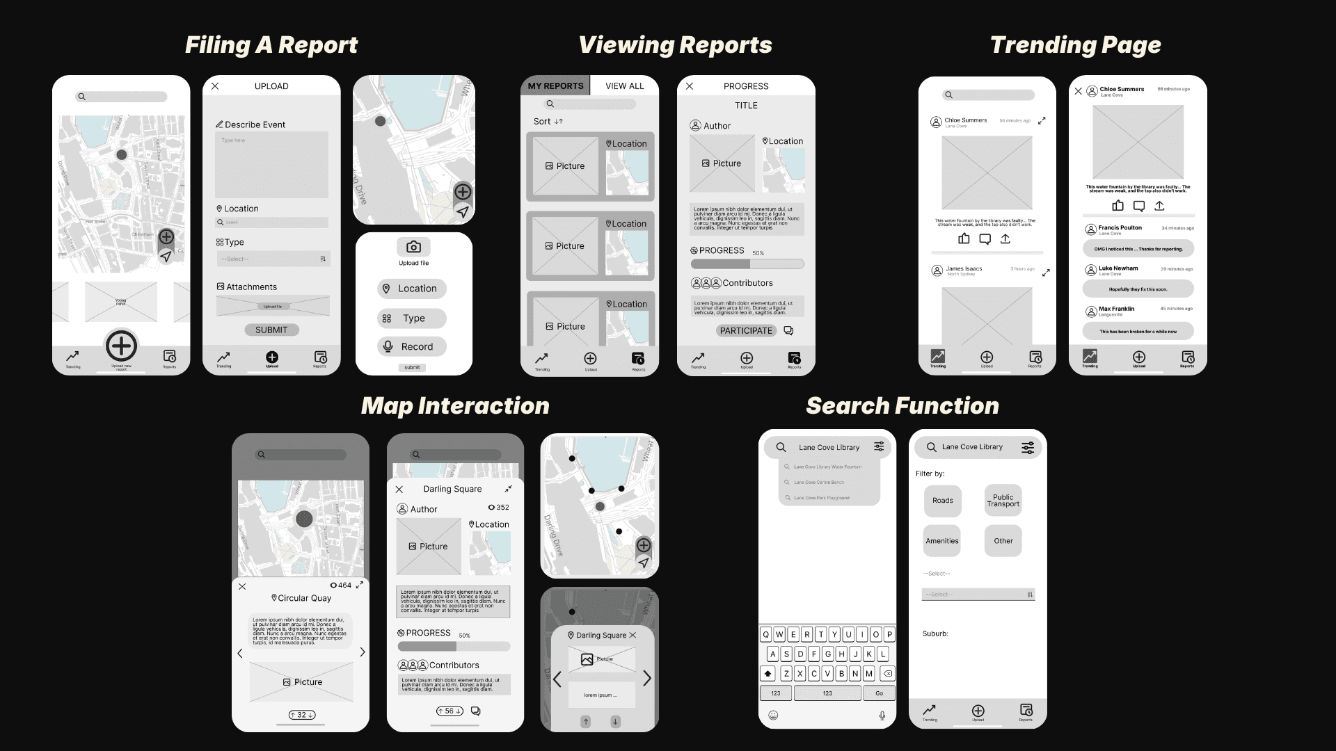
Mid-fidelity Prototype
Mid-fidelity Prototype
Using insights from usability testing, we developed a mid-fidelity prototype to directly address the key issues around navigation clarity, system feedback, and user confidence. The focus was on simplifying core tasks and reducing uncertainty for first-time users.
Using insights from usability testing, we developed a mid-fidelity prototype to directly address the key issues around navigation clarity, system feedback, and user confidence. The focus was on simplifying core tasks and reducing uncertainty for first-time users.
We refined the experience by introducing clearer safety cues and adjusting visual hierarchy through text size and button spacing. These changes were made to improve scanability, reduce cognitive load, and support more confident interaction.
We refined the experience by introducing clearer safety cues and adjusting visual hierarchy through text size and button spacing. These changes were made to improve scanability, reduce cognitive load, and support more confident interaction.
Mid-fidelity Prototype
Mid-fidelity Prototype
Final Usability Testing
Final Usability Testing
To validate the design before moving to high fidelity, we conducted both expert and user testing to identify remaining usability issues and confirm whether the interaction model matched user expectations.
To validate the design before moving to high fidelity, we conducted both expert and user testing to identify remaining usability issues and confirm whether the interaction model matched user expectations.
Expert Testing
Six usability experts reviewed the prototype, focusing on clarity, consistency, and interaction behaviour. They identified mismatches between interface cues and user expectations, which caused hesitation during key tasks. For example, the Home button appeared interactive even when users were already on the home screen, and the plus button was often interpreted as creating a new report rather than editing.
Six usability experts reviewed the prototype, focusing on clarity, consistency, and interaction behaviour. They identified mismatches between interface cues and user expectations, which caused hesitation during key tasks. For example, the Home button appeared interactive even when users were already on the home screen, and the plus button was often interpreted as creating a new report rather than editing.
Unclear system status
Unclear system status
Unclear system status
Users couldn’t tell when they were already on the home screen.
Users couldn’t tell when they were already on the home screen.
Inconsistent interactions
Inconsistent interactions
Inconsistent interactions
Some controls behaved differently than expected, reducing confidence.
Some controls behaved differently than expected, reducing confidence.
Misleading conventions
Misleading conventions
Misleading conventions
The plus button suggested adding a new incident rather than editing.
The plus button suggested adding a new incident rather than editing.
User Testing
In parallel, twelve participants completed core tasks using a think-aloud approach. Most users found the prototype easy to learn, but task flow slowed when labels were unclear or navigation elements were hard to distinguish. Tabs such as “My Reports” and “View All” were frequently confused, and users wanted clearer context, including dates on reports and small cues to explain actions.
In parallel, twelve participants completed core tasks using a think-aloud approach. Most users found the prototype easy to learn, but task flow slowed when labels were unclear or navigation elements were hard to distinguish. Tabs such as “My Reports” and “View All” were frequently confused, and users wanted clearer context, including dates on reports and small cues to explain actions.
Easy to learn
Users quickly understood the layout and core features.
Navigation confusion
Tabs like “My Reports” and “View All” were hard to distinguish.
Slower task completion
Clunky animations and interaction delays reduced efficiency.
Missing context
Users wanted dates, clearer labels, and small explanations to feel confident.
Easy to learn
Users quickly understood the layout and core features.
Slower task completion
Clunky animations and interaction delays reduced efficiency.
Navigation confusion
Tabs like “My Reports” and “View All” were hard to distinguish.
Missing context
Users wanted dates, clearer labels, and small explanations to feel confident.
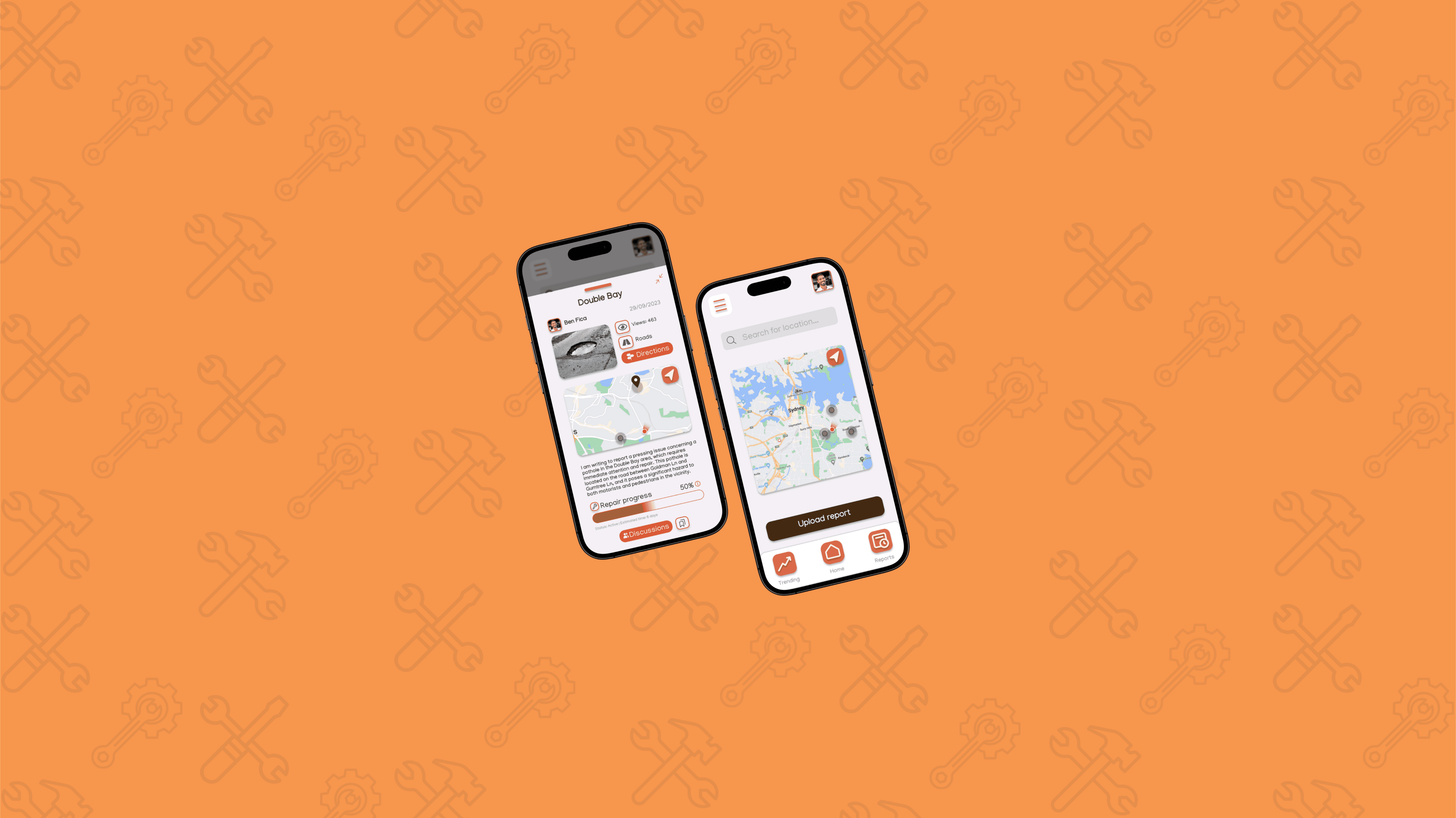
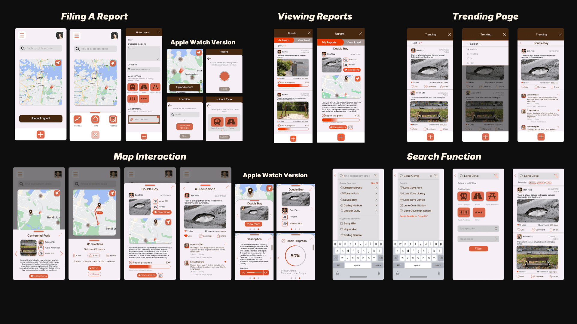
High Fidelity Protoype
High Fidelity Protoype
Building on insights from expert and user testing, we refined the prototype to address the remaining issues around navigation clarity, system feedback, and interaction consistency. I led improvements to key features such as navigation and report interactions, while the team focused on refining animations and visual hierarchy across the interface.
Building on insights from expert and user testing, we refined the prototype to address the remaining issues around navigation clarity, system feedback, and interaction consistency. I led improvements to key features such as navigation and report interactions, while the team focused on refining animations and visual hierarchy across the interface.
To communicate the final concept, we produced a short promotional video demonstrating how residents can report issues, track progress, and understand system status through the app.
To communicate the final concept, we produced a short promotional video demonstrating how residents can report issues, track progress, and understand system status through the app.
Promotional Video
Promotional Video
Reflection
Reflection
Working in a three-person team required balancing research, design, and testing across parallel workstreams. Synthesising insights from focus groups, surveys, and online analysis was initially challenging, which pushed us to be more deliberate in translating research into clear design decisions.
Working in a three-person team required balancing research, design, and testing across parallel workstreams. Synthesising insights from focus groups, surveys, and online analysis was initially challenging, which pushed us to be more deliberate in translating research into clear design decisions.
I focused on core interaction flows such as navigation and report interactions, while my teammates refined animations and visual consistency. This collaboration highlighted how closely interaction design and system feedback shape user confidence, and how small interface details can significantly affect usability.
I focused on core interaction flows such as navigation and report interactions, while my teammates refined animations and visual consistency. This collaboration highlighted how closely interaction design and system feedback shape user confidence, and how small interface details can significantly affect usability.
This project reinforced the importance of research-driven iteration and evidence-based decision-making. It strengthened my confidence in prioritising feedback, making trade-offs under constraints, and refining designs through testing. With more time, I would explore how the system could scale with real council integration and support larger community use.
This project reinforced the importance of research-driven iteration and evidence-based decision-making. It strengthened my confidence in prioritising feedback, making trade-offs under constraints, and refining designs through testing. With more time, I would explore how the system could scale with real council integration and support larger community use.
Other Works
Other Works
Other Works
Griddy Boards
Collaborative drawing pods that turn casual campus spaces into creative hotspots.
Collaborative drawing pods that turn casual campus spaces into creative hotspots.
Hidden Factors
A UX research project uncovering how subtle task traits influence productivity.
A UX research project uncovering how subtle task traits influence productivity.
Beyond Academia
Design work completed in collaboration with companies, alongside select independent and passion projects.
Design work completed in collaboration with companies, alongside select independent and passion projects.
Glad you were here :)
I'd love to hear from you!
Kyaw Nyi Nyi
2025©All rights reserved.
Social
Glad you were here :)
I'd love to hear from you!
Kyaw Nyi Nyi
2025©All rights reserved.
Social
Glad you were here :) I'd love to hear from you!
Kyaw Nyi Nyi
2025©All rights reserved.
Social